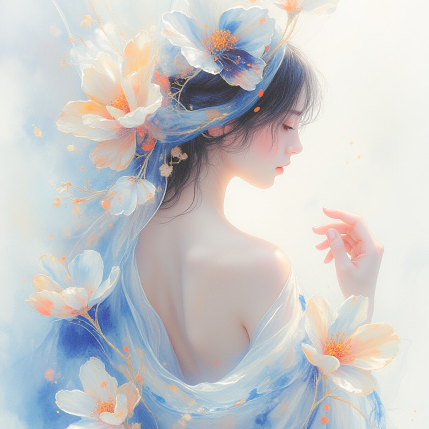
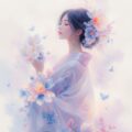
表情、指の形と左下の水彩感がとても気に入ってます。
Ephemeral Blossom Dreamのプロンプト・設定
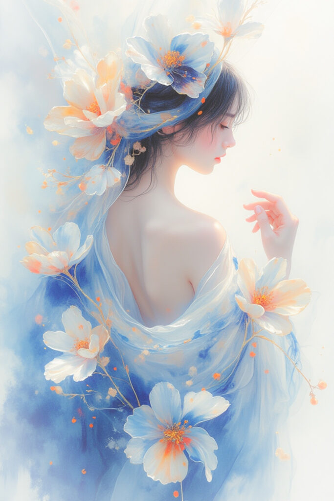
「Ephemeral Blossom Dream」はTensorArtで出力しました。
この作品は「Blooming in the Light」を生成している中でできました。
プロンプト
出力に使用したプロンプトです。
| プロンプト | A sensual watercolor illustration featuring an elegant figure draped in a silky flower that wraps gracefully around the body, its petals softly dissolving into the background like delicate brushstrokes merging with air. The petals mimic the intricate patterns of blue and white porcelain, their edges subtly bleeding into the surrounding mist, creating an ethereal, dreamlike effect. The colors gently blend and flow together, as if carried by an unseen breeze, enhancing the organic softness of the composition. Rendered in a soft watercolor technique, the artwork emphasizes the fluidity of pigments on wet paper, with delicate color transitions and blurred edges giving the scene a sense of gentle movement. Soft washes of pastel hues melt seamlessly into one another, while subtle splashes and blooms of watercolor create a natural diffusion, echoing the delicate imperfection of traditional hand-painted artwork. Light filters through the translucent petals and fabric, casting a soft, shimmering glow that enhances the sense of weightlessness and serenity. A vintage and retro aesthetic emerges through the flowy design and intricate details, while the hand-painted watercolor texture amplifies the organic, dreamy quality. Inspired by the works of Hannah Dale and Harumi Hironaka, this piece radiates elegance and tranquility, with expressive yet delicate tones that evoke a timeless, fleeting beauty. Every detail, from the silky texture of the flower to the porcelain-inspired patterns, appears as if suspended in a moment of fluid harmony, where reality and illusion intertwine effortlessly. |
| ネガティブ プロンプト | (設定なし) |
ふんわりぼかしの追加
ふんわりぼかしはAdobe Lightroomを使って、以下のパラメータを設定しました。
幻想的な感じを出すため、強めにふんわり感をかけています。
| ライト | 露光量 | +0.18 |
| コントラスト | 0 | |
| ハイライト | 0 | |
| シャドウ | 0 | |
| 白レベル | 0 | |
| 黒レベル | 0 | |
| カラー | 色温度 | 0 |
| 色かぶり補正 | 0 | |
| 自然な彩度 | +10 | |
| 彩度 | 0 | |
| 効果 | テクスチャ | +8 |
| 明瞭度 | -44 | |
| かすみの除去 | -9 | |
| 周辺光量補正 | +44 | |
| 中心点 | 50 | |
| 丸み | 0 | |
| ぼかし | 50 |
最後に
AIイラストは同じプロンプトでも異なる素敵なイラストができるので、面白いですね。
つい何度も生成ボタンを押してしまうこともありますが。。。
ただ、何度か作っているうちにこうした方が良いかなと新たなアイデアや追加したい雰囲気を思いつくことも多いです。
いろいろ新しいアイデアや雰囲気を入れていきますね。
何かよいアイデアやこんなの追加したらどう?ということがありましたらコメントで教えてください!
コメント